Logo design 01

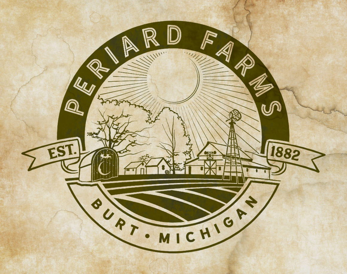
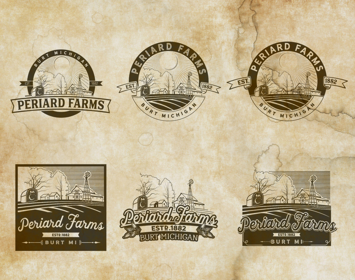
[vc_custom_heading text=”Periard Farms Logo” font_container=”tag:h6|font_size:25px|text_align:left|color:%235e4e3b” use_theme_fonts=”yes” text_transform=”uppercase” css=”.vc_custom_1691703618509{margin-bottom: 10px !important;}”][ut_header align=”left” title_color=”#252525″]Some generational family farm members approached me to create a vintage style logo that featured some of the unique buildings on their property.[/ut_header]
[vc_custom_heading text=”THE ART of VISUAL INFORMATION” font_container=”tag:h3|text_align:left|color:%23252525″ use_theme_fonts=”yes” text_transform=”uppercase”]

Creating simplistic, clean line art may seem easy, but making the most out of every line creates challenges. Too many lines, the visual becomes muddled and hard to read. Too few lines, and there is no visual information. Brian has a unique talent for finding the right balance of creating artwork that carries the visual information, while still being able to be reproduced easily – whether it is printed on a flyer, a T-shirt, a van wrap, or a billboard.

This job was done through emails with the client. On the right are a few examples of pictures that the client sent, along with a rough sketch of what they thought they wanted. Luckily enough, Brian’s first round of sketches were just what the client wanted, and with a few tweaks the final logo (below) was created.
[ut_social_share_bar share_text=”SHARE:” share_text_color=”#252525″ icon_color=”#5e4e3b”]
[vc_separator][ut_portfolio_details values=”%5B%7B%22title%22%3A%22CLIENT%3A%22%2C%22description%22%3A%22Periard%20Farms%22%7D%2C%7B%22title%22%3A%22PROJECT%3A%22%2C%22description%22%3A%22Logo%20design%22%2C%22link%22%3A%22url%3A%2523%7C%7C%7C%22%7D%5D” title_color=”#252525″][ut_image_gallery grid=”2″ gallery=”4026,4027,4028,4029″]